Iron Velvet
Iron Velvet is a french digital studio crafting web experience. They got one motto : Wreck boundaries. Build connection. Quite a warlike vocabulary, right ? They also have a strong set of value, so the idea was to merge the idea of a brotherhood with a medieval style. As they are still producing modern web experience (as this website), I went for a light and punchy color palette : like a punch in the guts followed by a tap in the back.
Research
I offered 4 different solutions for the brand identity of Iron Velvet. The final choice was a mix between two of them. It was a tough choice because two of them were completely different identity system. One was more cartoonesque, dragging on the « fresh and positive » side. The other one was a little bit « mystical », evoking the magic they want to put in their web experience. They went for the second one.
And Voilà !
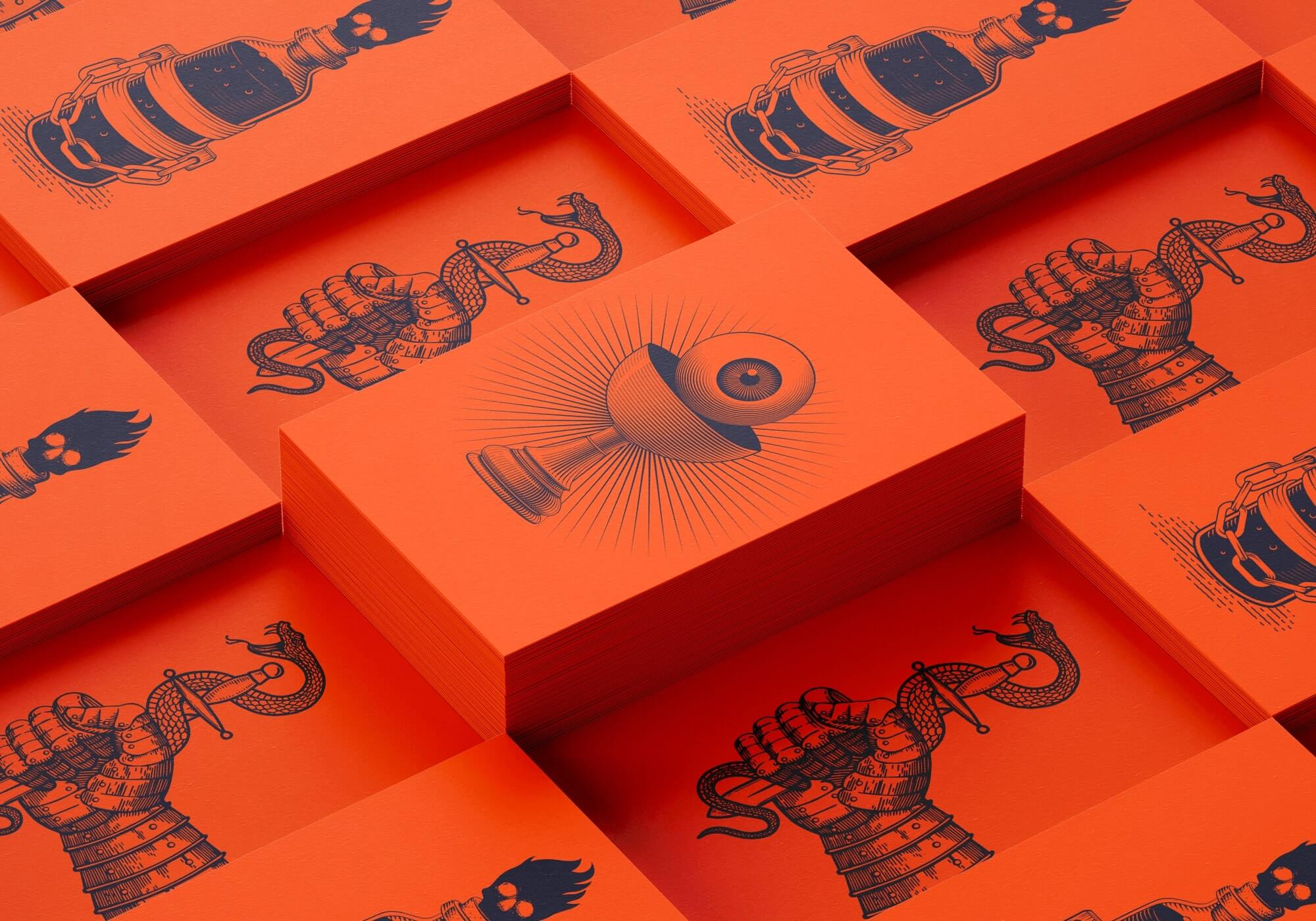
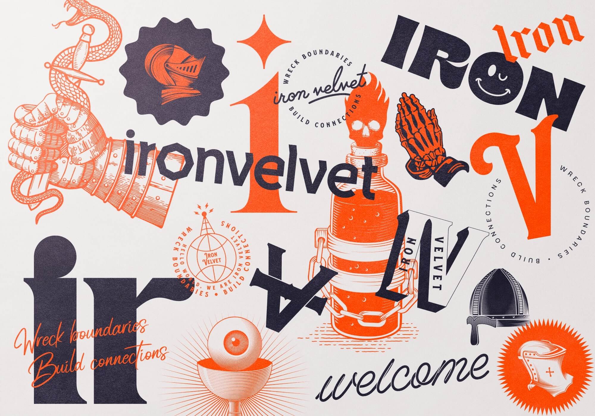
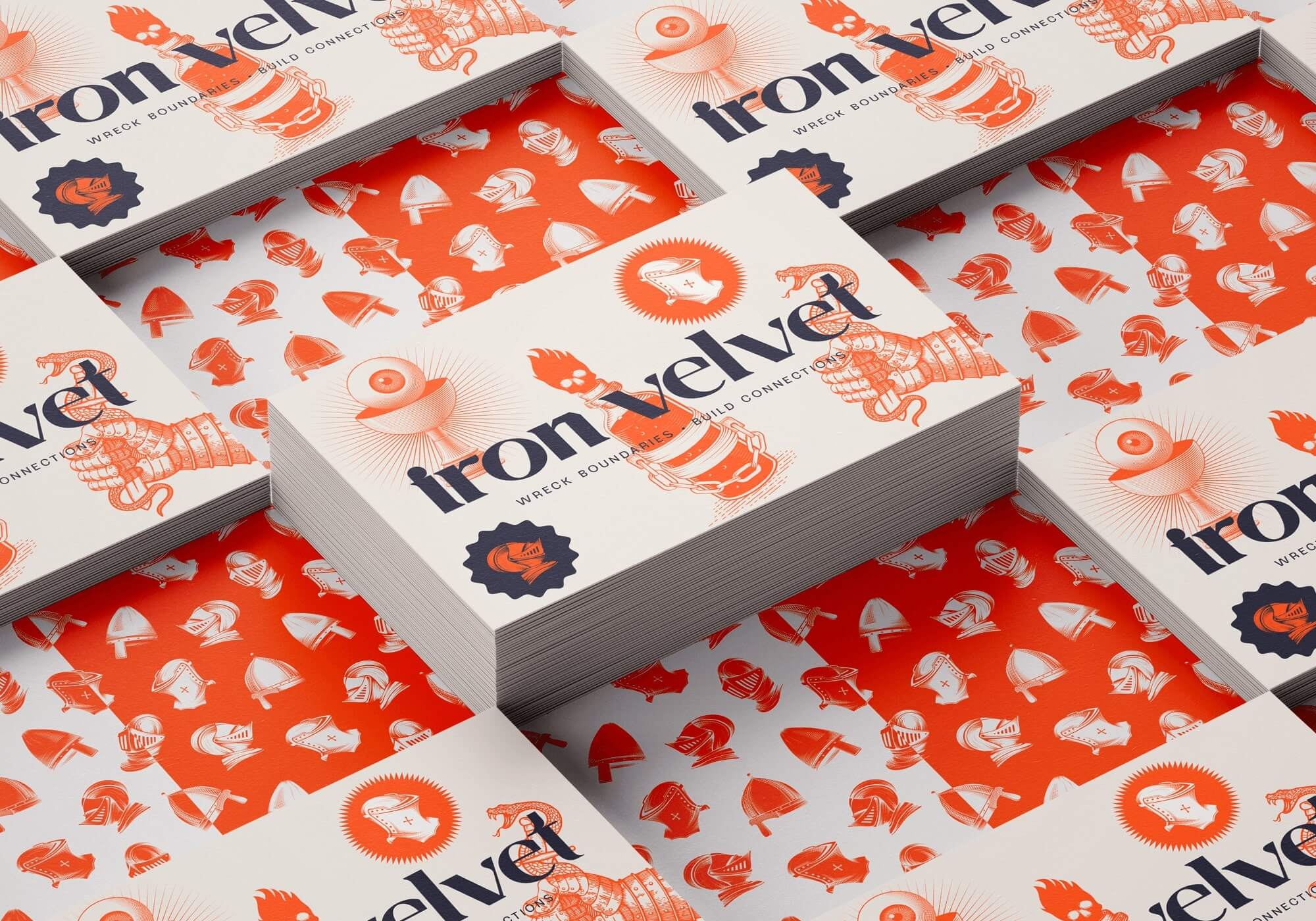
A fresh and mystical brand identity. Using a 3 color palette : Dark Blue – Cream – Flashy Orange.